If you recently complained your logo was too small, don’t worry. You’re not the only one who suffers from this affliction. In fact, this complaint is so popular it has inspired countless satirical parodies and Internet memes devoted to “make the logo bigger”.
Why is my designer making my logo microscopic?
Believe me. We understand the drive behind wanting to to be memorable and unmistakable. You may have invested quite bit into your logo and that should be the focal point of your company image and branding strategy, right? Wrong!
Big logos actually look quite cheesy.
They are the equivalent of screaming at your audience, “Look at me! My company has a cool logo! Please look at it and remember it! I don’t have much else to offer because the logo is my focal point. Pay attention to it! No, I don’t really care about solving your problems or giving you what you’re actually looking for in the first place since that’s obviously secondary. Just check out my big logo, you can’t miss it. If you miss it, you will forget me. My logo is the only thing that sets me apart from competitors. Look at it!”
Big logos are like overcompensation for lack of good content.
Big logos are like opening up a huge bag of chips only to find 3 pieces of chips.
Big logos are like punching a visitor in the face and saying, “Made ya look!”
Too much brand ego can negatively affect your website.
While it’s great to take pride in your company, always remember your website is built to serve your customers, not you. In order to increase brand awareness, business owners have a natural inclination towards making their logo bigger, but you need to curb the urge if you care what most users think. Are users buying your products and services or your logo?
Determine what your most important headlines and elements on the page are (if you still think it’s your logo, then try to write better sales copy) and work backwards from there. Keep in mind, large sizes and higher up the page positions emphasize elements and while smaller sizes and lower positions de-emphasize elements.
And remember, everything is relative! This often contributes to “make everything bigger” syndrome. If you make everything big, then nothing is 'bigger.' If you think everything is equally important then nothing is really emphasized because everything is the same size ie. big. You don’t want 5 giant headlines jumping at the viewer in a competing collage of clutter. Something has to be made smaller in order for something beside it to appear bigger. Makes sense?
To quote American designer John Maeda,
Simplicity is about subtracting the obvious and adding the meaningful.
John Maeda
It’s important that your website’s landing pages carefully balance all elements in a hierarchy of importance. How can you tell if your logo is way too big? If your logo text is bigger than any other text on the page, then your website will likely suffer some lost conversions.
How will people remember our brand if we don’t constantly shove our logo in their face?
While there is some brand-building merit to plastering your logo all over public spaces and banner ads, your website is not the place for this. Your website is where you actually deliver. Solid branding is built through good service, association and reputation, not big logos.
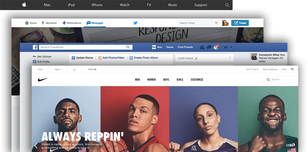
Well-branded companies actually downplay their logos.

Still have doubts?
Show us a well-known company with a bigger logo than any other text on the page (must be a standard landing page with at least 100 words on it) and email it to us. We’ll publish it as a successful rule breaker. It's important to emphasize your content, not your brand. If you deliver a great experience for customers, your brand will speak for itself.


