For a business owner, a website is a marketing tool. It is ultimately used to sell products and services, in one way or another. That is the end goal. Along the way, it can establish your brand, enhance your image, educate consumers and generate new leads or opportunities, but how does it affect your bottom line? Does your website convert your audience into loyal customers? Is your website designed to SELL?
Business websites must go a step above user-centered design to conversion-centered design. A conversion is the process of convincing your website visitors to complete a meaningful action on your website that ultimately results in a sale or contribution to your cause.
Don’t get crazy about driving traffic until you have something to show them.
Visitors judge the value of your website within about 4 seconds. Hours of hard work are squeezed into one judgmental look that decides whether or not your website is worth another click.
While effective landing pages are often industry-specific, the vast majority of them contain some common denominators that will make or break your final “sale”. The following image illustrates some of the best practices when it comes to designing websites that are proven to work consistently.
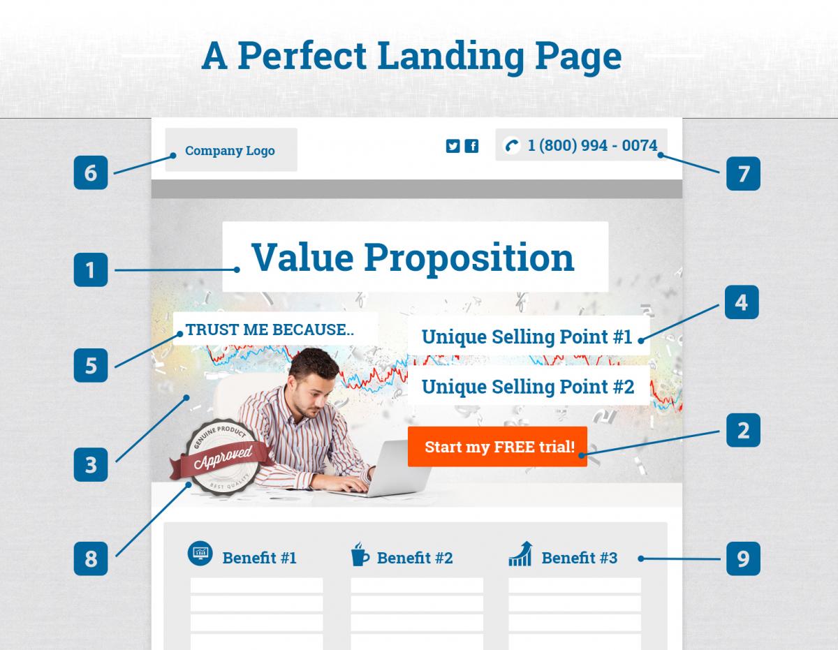
Organized loosely in order of importance:
1) Value Proposition
One of the most overlooked and underrated items on a website is a simple positioning statement that explains what benefit you provide. It is usually the first and biggest element your audience sees and often the most determining factor to whether users click-through the website or hit the Back button.
Before you dive into how great your company is, or place that awesome, yet ambiguous tag line that only makes sense in context, please remember to state who you are and what you do.
Let's take a look at Opera's old landing page. I found this on a website that cites examples of great landing pages. The first example was a perfect example of a not so great landing page:
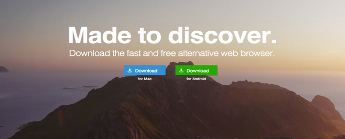
At first I thought Newfoundland ripped off Ontario's tagline "Yours to discover." When you read the second line, you realize it's a browser they're promoting. I'm all for metaphorical and beautiful imagery on websites, but this is the most vague Title + Image pairing.
Opera has since fixed this issue.
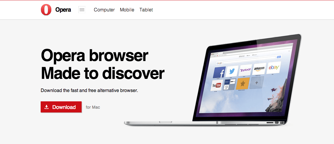
Much better.
2) Call-to-action (CTA)
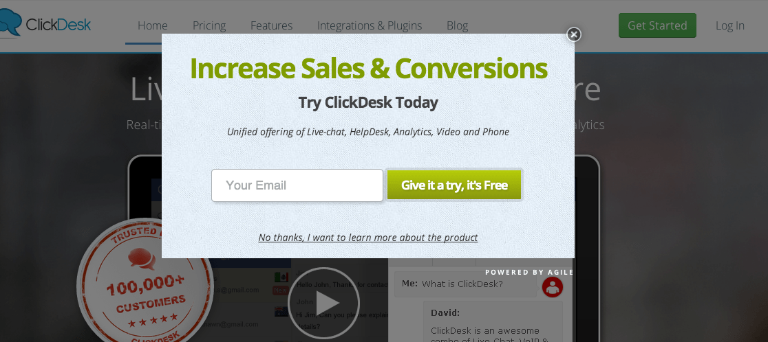
What do you want users to do on your website? Should they just call you? Should they buy something? Should they request a quote? Should they explore more areas of the website? Spell it out for them. Users like to be subconsciously guided through an interaction.
We’ve seen it everywhere: Start my Free Trial!, Sign-up Today, Request a Free Quote, Subscribe Now, Book your Free Consultation, etc. It can even be as simple and powerful as Call us Today! and Add to cart. An effective landing page is all about the fine art of persuading the user to complete a single business-driven objective. If you close most sales over the phone, make sure the business number is prominently displayed.
If you have a longer sales cycle, you need to bait your audience more slowly with CTA’s like Learn more, View Demo or Get your Free Report! A great call-to-action has to be industry-appropriate and directly related to the question, “How do you close most of your sales?”

3) Design / Imagery
We double-checked the data and it’s confirmed - pictures are worth a thousand words. Your website should contain professional images and/or graphics.
Even if it looks like there are no images and the website still looks amazing, this just means the graphic artist was a genius. Never underestimate good typography and whitespace.
Did I just contradict myself?
The conversion value of images is dependent on the industry. You have to include spectacular photos for the obvious – fashion, food, travel, aesthetics and most tangible products. For some services, like tech, accounting and consulting for example, we can get away with icons, infographics, and beautiful typography, without hurting conversion rates.
But whenever you can include an image, make an impact. Avoid cheesy overused free stock photos.
4) Unique Selling Points (USP)
Unique selling points tie in with your value proposition. What sets you apart from competitors? Why should the potential customer choose you?

Price is one of the most popular selling points. Not sure I would call it unique, but it works.
5) Reputation
People are more responsive to the thoughts of other people about your business than to what your business has to say about itself. Reviews, 3rd party testimonials, case studies, media appearances, prominent clients, and even showing how many customers you have helps build trust in the minds of your audience. According to a survey conducted by Dimensional Research, 90% of buying decisions are influenced by online reviews.

6) Logo
In general, the logo really matters if it’s below a certain threshold of aesthetics. That is, if all other factors remain the same, the difference between a good logo and a spectacular logo is negligible for conversions if your USPs and CTAs are strong. However, if your logo was designed in a word document using Comic Sans or you have an emotional & financial attachment to something that was trendy in 1996, you would be well advised to update it. Your conversions will thank you.
Keep your logo fresh like Hertz.

7) Phone Number
This one’s obvious. Because we work mostly with small-medium businesses, phone number prominence is absolutely essential. Two years ago, I would have said it should always be big, bold, and displayed in the top right corner. However, as user behavior online became more fluid, so did the ideal position of this phone number, especially with the rise in popularity of mobile devices. Almost anywhere along the top is acceptable today. If your business is particularly phone call driven, it’s a good idea to repeat the phone number in larger formats throughout your web pages in more than one location.
8) Trust Symbols
Badges, certificates, partnerships and awards are an extension of reputation and are very important in certain industries. Experienced online users are hyper-sensitive to sketchy websites and most users have a decent scam radar, so don’t underestimate the importance of your credentials, awards, and verifiable qualifications. Not all badges belong front and center though. If you have a BBB accreditation, for instance, it can be displayed more subtly
9) Features / Benefits
Adding the features and benefits of your product or service is an extension of your USPs. This section should generally prop up and support the main elements on top. A very common request from web design clients (even in 2014) is to “fit” all elements in the “browser window” so that the user does not have to scroll to see the benefits. There is certainly some merit to this, as your CTA should definitely be positioned above the fold (so you can see the CTA without scrolling). However, it is impossible to prevent scrolling if you wish to include many features and benefits. Scrolling is ok. At least 99% of users know how to scroll. But remember: the most important content goes at the top followed gradually by lesser content as you scroll down to the bottom.
Exceptions and Considerations
While these guidelines apply to most business websites, there are always exceptions and new adaptations. User experience is a continually evolving and changing behavioral process that responds differently in various conditions.
Your website must cater to its target demographic, culture and geographic areas. Older users need huge fonts, high contrast, and less scrolling and clicking than younger users. Younger users respond well to trendy and highly dynamic websites.
A prominent exception to the “general landing page rules” is online stores, catalogues and multi-product displays. The “landing pages” for such websites involve the direct display of the full range of “offerings” that users are searching for, like pointing to a specific aisle in a retail store.
There's no such thing as a Perfect Landing Page
There is no web page that can convert 100% of its visitors. Great conversion rates on average actually range around 1 - 2%. As web marketers, we strive to maximize conversions from the potential number of users who can be converted.
