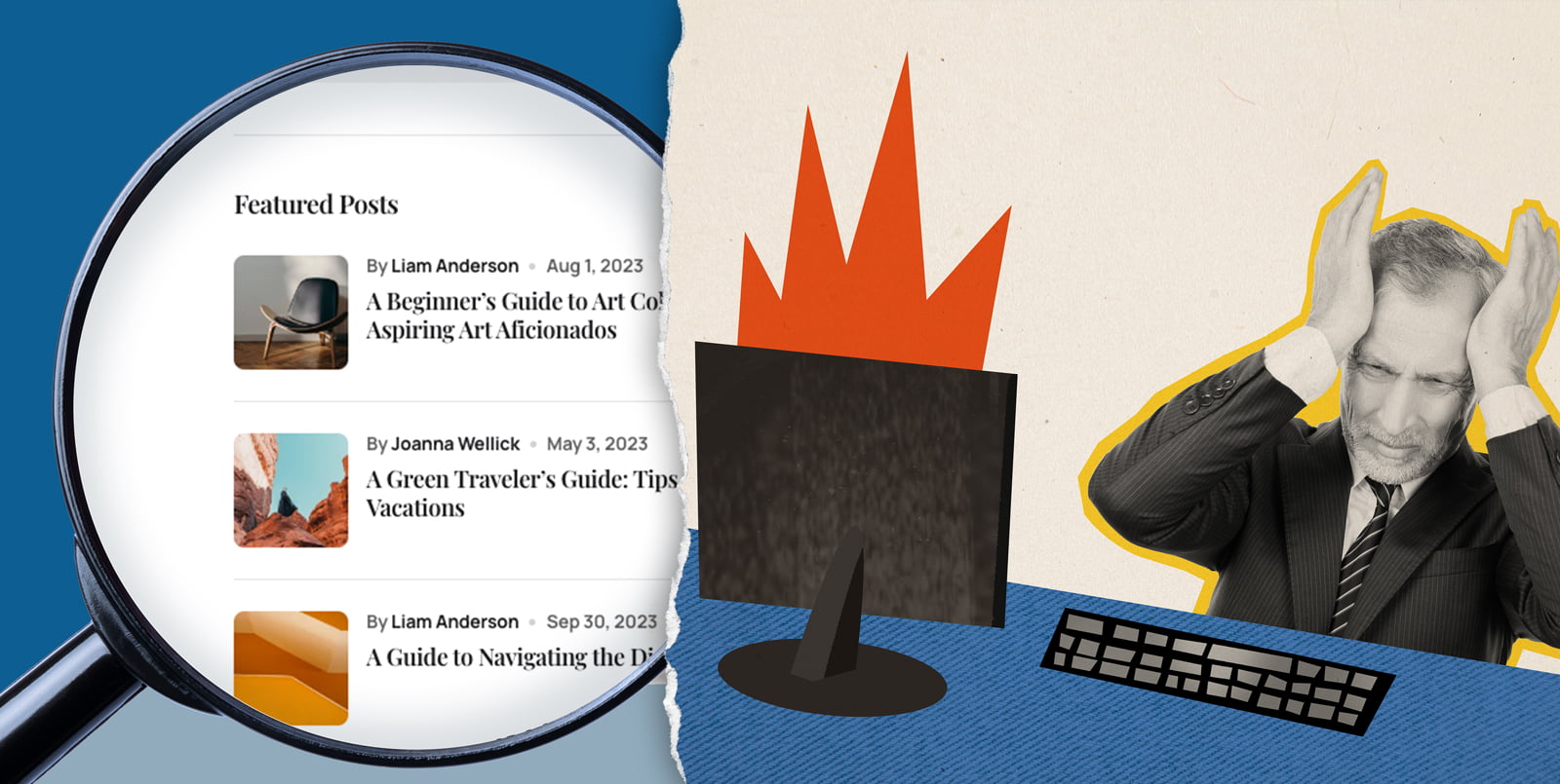
My dear fellow marketing teams and tech-dabblers, let's talk about a journey many brave souls embark on: DIY content management.
It can be a bit like How a Web Design Goes Straight to Hell, except we're potentially destroying the back-end at the same time as the front, and just because you 'can' doesn't always mean you should.
Let's unpack the pros and cons ...
The DIY Dilemma: Should I learn how to use my website's front-end editor, or outsource it to a pro?
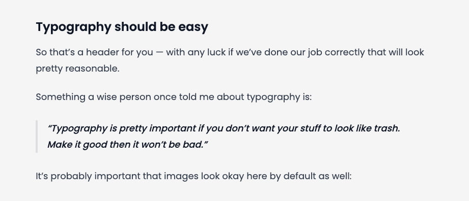
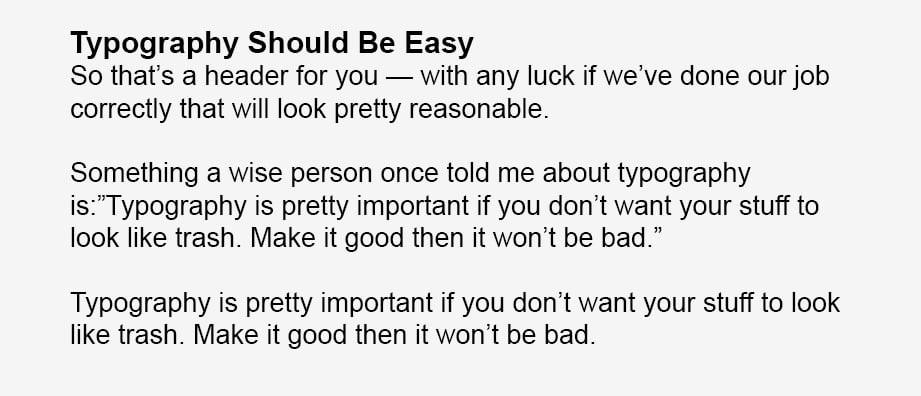
You cannot just copy / paste everything.
1. What is my time worth?
When you look at the big picture of your overall online presence, ask yourself this:
What is my time worth? ... and where am I most needed?
When it comes to navigating the world of WordPress editors, which, despite their alluring marketing promises, each comes with its own unique learning curve.
The Learning Curve Paradox
Imagine learning a new language. WordPress editors are somewhat similar. No matter how sleek and user-friendly they claim to be, there’s always a period of adjustment, of trial and error. This is the learning curve – an invisible cost measured not in dollars, but in hours, frustration, and the potential for big mistakes.
And here’s the added tax: the easier an editor is to use out of the box, the more likely it is to limit your creative freedom. It’s a bit like coloring with a set of four crayons versus an entire box; the former might be simpler, but it severely limits your output. On the flip side, editors that boast endless customization options and flexibility also demand a hefty investment of time to master. It’s the classic trade-off between convenience and capability.
Time-Cost-Benefit
Every moment spent wrestling with an editor or untangling the web of design principles is time that could be invested elsewhere – growing your business, creating content, or engaging with your audience. It’s vital to ask yourself: is the time I’m investing in learning and tweaking this tool yielding a return worth its weight in gold (or, at least, in peace of mind)?
The Cost of Screwups
There's an often overlooked risk that deserves its own spotlight: accidentally breaking your editor due to inexperience. Venturing into the frontish backend of a website without a clear understanding of how changes can impact overall functionality is akin to walking a tightrope without a safety net. The wrong tweak can lead to disastrous outcomes, from minor glitches that frustrate users to major breakdowns that take your site offline.
This gamble not only threatens the integrity of your site but also carries a hidden cost. When things go awry, repairing the damage often requires professional intervention, which can be significantly more expensive than ongoing maintenance. Each misstep increases the risk of creating complex problems that demand extensive time and resources to resolve, turning what was intended as a cost-saving measure into a costly ordeal.
The Professional Alternative
Opting for professional content management is not merely a time-saving choice; it's a deliberate investment in quality. Professionals bring a depth of expertise that transcends the basic functionality of WordPress editors, ensuring every aspect of your website—from its aesthetics to its user experience—is meticulously crafted.
This commitment to excellence means that your site not only looks stunning and operates flawlessly but also embodies your brand's ethos and engages your audience on a deeper level. By entrusting your digital presence to the pros, you're ensuring that your website not only meets but exceeds industry standards, with every element designed to resonate with your visitors and stand the test of time.
2. "Design" Principles, or Lack Thereof
So, you've got a professionally built website, and you think, "I can handle this!" Enter the world of DIY updates. I decided to try my hand at it, and oh boy, was it a trip. Mixing headers like a salad bar led to a chaotic typographic party where raw format images were the uninvited guests.
The Hodgepodge Outcome
Next up: playing with formatting and layouts. Imagine embarking on a creative spree, where each webpage becomes a canvas for spontaneous expression.
While this might sound artistically liberating, the result often mirrors a digital patchwork quilt—each piece telling a different story, but together, failing to present a cohesive narrative. Here, the style schemes are as varied as the seasons, and layout patterns seem to follow the beat of a different drum with each click. This inconsistency isn't just visually jarring; it dilutes the brand message and undermines the professional credibility of the site - and nothing kills conversion rates faster.
The Misuse of Space and Scale
Without a guiding understanding of balance and hierarchy, content can become either overcrowded, overwhelming the user, or too sparse, leaving the site feeling unfinished. Images and text compete for dominance, with neither being properly showcased. This lack of structure makes navigating the site a challenge, as users struggle to identify focal points and key information.
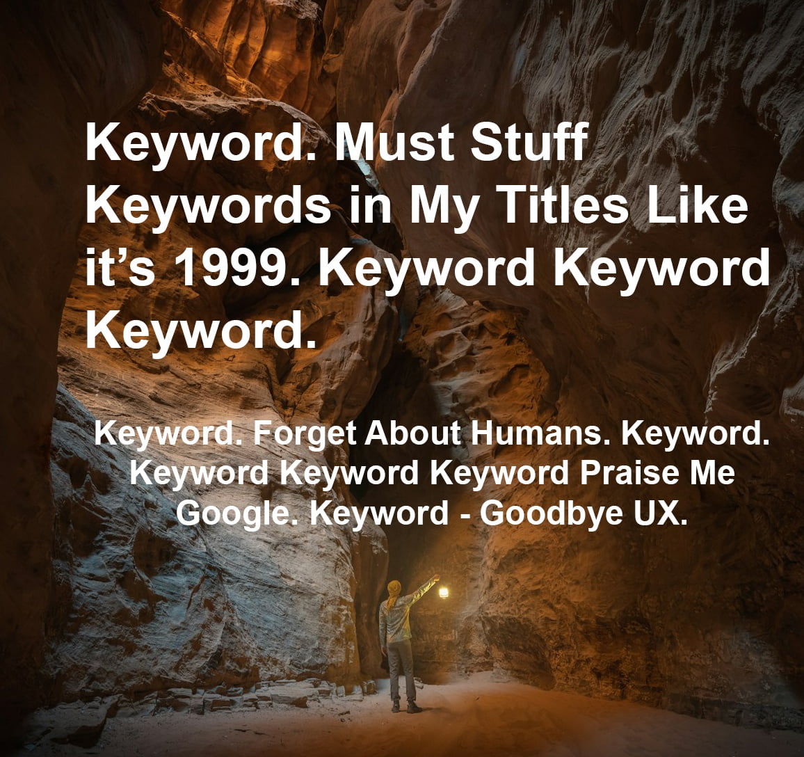
Praise me, Google
I will sacrifice my UX on the altar of keyword spamming my content into oblivion.
I have hired a 'cheap SEO guru' who says we need more keywords, so more is more right? Let's light this website on fire with the nonsensical word salad I have stuffed into every nook and pixel.
Forget that it's unreadable by actual people. Google is King.
The path to SEO enlightenment is not paved with keywords alone. While strategic placement in title tags and metadata remains crucial, the golden rule is moderation.
Your page rank no longer hinges on appeasing the algorithmic gods with keyword offerings but on crafting experiences that resonate with human emotions and interaction. The obsession with overloading header tags and content with keywords can often be counterproductive because such practices inflate bounce rates, signaling to Google a site's failure to satisfy the queries of its visitors.
3. Image Chaos
Proper image processing for web is where enthusiasm meets the harsh reality of digital discipline. One must carefully balance image quality and resolution with technical efficiency—a balance that ensures a site not only captivates and communicates effectively but also operates smoothly, loads quickly and meets on-page SEO standards.
Fat File Syndrome
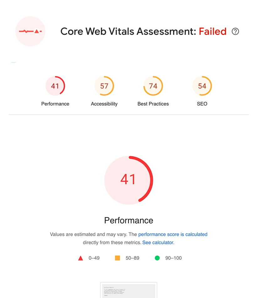
The mismanagement of media files is one of the top crashers of servers. Your web developer likely has a fat file phobia because of this.
Well-intentioned site owners, armed with high-resolution photographs, upload these gargantuan files directly onto their servers. These raw-format images, while stunning in detail, are ill-suited for the web. Their massive file sizes burden the server, leading to decreased site performance and, in the worst-case scenario, causing everything to crash.
Sorry, there is no fat acceptance movement for media files. There is no health at any size for media files. Your files have to be as close to size 0 as possible, otherwise please remove them from the server.
Lost in Translation: Proportions and Pixel Density
What happens when DIYers navigate the visual aspect of their sites without a clear understanding of image proportions and pixel density ratios? A bewildering collage of pixel vomit: portrait dimensions replaced by landscape dimensions, gaps and holes, too much whitespace or lack thereof, zero balance, and of course, the dreaded blurry or pixelated image because the pixel density ratio for retina displays was miscalculated. Also - there's the stretchy image problem, but that was so 1999, so if we run into that again, we seriously have to go back to web editing 101.
Naming Conventions: SEO and Accessibility
One of the most overlooked aspects in the realm of DIY image management is the strategic use of SEOfriendly and web-friendly file naming conventions.
Rather than leveraging descriptive, keyword-rich filenames that enhance search engine discoverability and user understanding, many fall into the trap of using generic, context-less names like DSC_0058.jpg or IMG_20230101_0002.png. This practice not only misses a critical opportunity to improve SEO but also adds a layer of confusion for visually impaired visitors trying to decipher the content of the images.
In sum
Navigating the front and back-end of DIY content management presents a series of unexpected challenges for many that may extend far beyond the initial allure of autonomy and creativity.
Opting for professional content management goes beyond merely avoiding technical issues; it can be a strategic choice that aligns with the broader goals of your brand's growth, visibility, and engagement.
By entrusting the details of your site's maintenance to experts, you're not just ensuring a seamless, functional, and visually compelling online presence; you're also reclaiming precious time and resources that can be redirected towards nurturing your business, innovating your offerings, and deepening connections with your audience.
Ready to brave the DIY content management journey?
Dive deep with our WordPress training sessions
Prefer to prioritize your time and quality?
Let the pros handle your WP tasklists.
