Do you spend countless hours and dollars generating traffic to your website but no one seems to engage? Here are 7 signs it might be time for a complete website overhaul.
1) You still greet your potential customers with an intro or splash page.
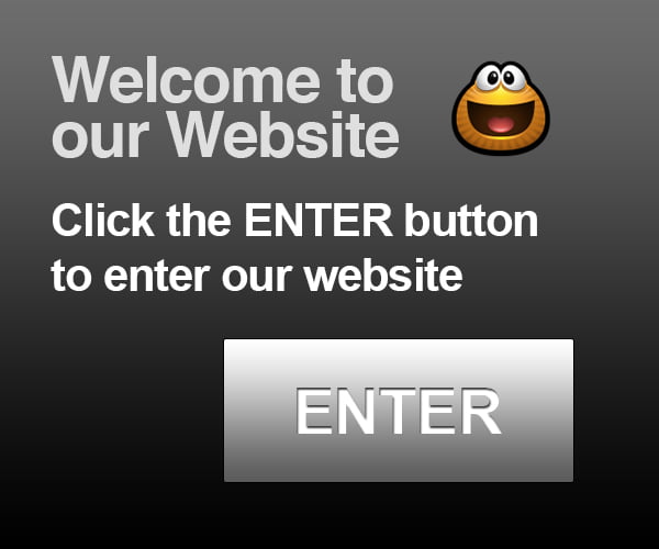
Nobody wants to click twice to find what they’re looking for. And especially, nobody wants to sit through your “super cool” high tech animation (unless you happen to be in the digital animation industry). Your bounce rate will soar and your conversions will plummet. An intro page is just another barrier between your potential customer and what you have to offer. It’s best to keep your audience’s experience smooth and simple.
2) You dazzle your audience with animated GIFs and scrolling text.
Only personal websites can get away with relics from the 90’s. If you’re trying to sell something, ditch the winking puppy and the scrolling announcements. It usually looks tacky.
3) Your website looks like pixel vomit on a mobile device.
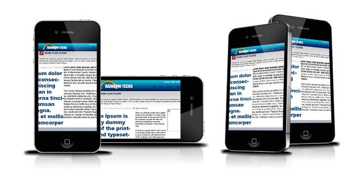
It’s essential that businesses understand that most online browsing today is happening on a mobile device. If you want to remain competitive online, get with the times. Make sure your website is responsive, or at least mobile compatible.
4) Your website endured some heavy Flash abuse.
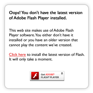
Flash is all but dead. The 16-year-old technology does not work on mobile devices, and it does not cooperate well with search engines. Not to mention, does anyone miss those friendly reminders to install the latest version of Flash?
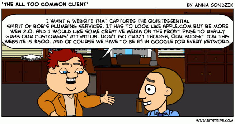
5) A friend or relative who does websites as a hobby on the side built your website.

Web design is so easy. Just find a free template online and upload your content. Piece of cake - a monkey can do it. Yeah right.
According to Webydo, 98% of websites set-up by amateurs don’t even make it online. Out of the 2% that go live, the success rate of amateur websites in the business world is close to zero. A website is often the first impression that people have about a particular business. It's better to have no website at all than a cheap one. An amateur website makes most people think you have an amateur business.
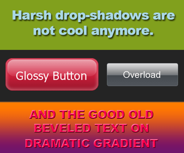
6) Your website fell victim to some passe web design trend or fad.
Web design is like fashion. If you opt for something ultra hip or trendy, be mindful of the future. Timeless, classy, corporate (think suit and tie) compositions might be a little more “boring” but they will stand the test of time. If you went crazy over Web 2.0 five years ago, like many, be prepared to update the design every 2 – 3 years to keep it fresh. Some industries need trendier websites than others. However, almost every design element has an expiry date. If your website still rocks glossy buttons and hard drop shadows, it might be time for an update.
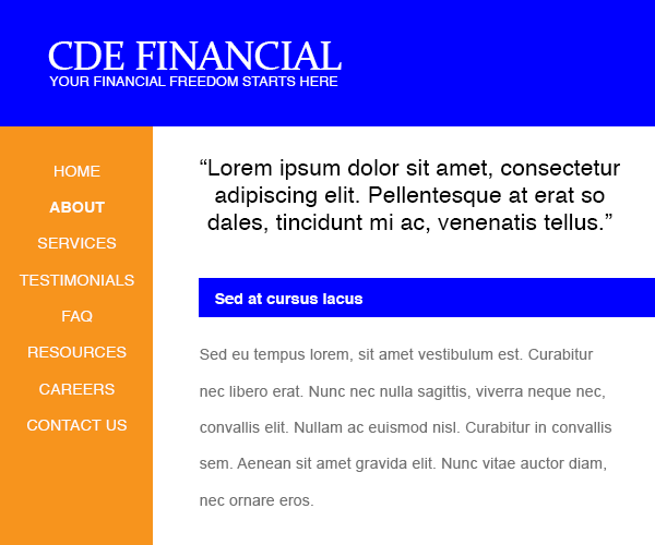
7) Your website looks and reads like a print brochure.
In the mid 90’s, when the Internet just started to really take off, company websites were intended to function as extension of print brochures, like a way to save paper and printing costs. Websites today are not just virtual “brochures.” Do not just transfer your brochure content to your website and think that settles it. If you don’t interact with your audience in any meaningful way, you will lose business to your competitors who will.