The same old mistakes have been popping up since 1996. Although there's been massive improvement in web design overall (check out the Way Back Machine for screenshots of how web sites looked in the past), we still see the following issues on a regular basis:
1) Straying From Design Conventions
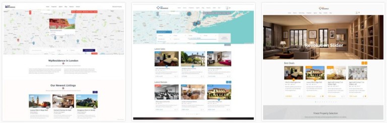
Let's face it: users spend most of their time on other websites. Having acquired some of the universal standards and habits, an individual will form certain expectations of your site based on what they've seen on other sites. If your website suddenly has a bottom navigation bar; or a different template on each page; or odd scroll features; or worse yet, tons of special effects, chances are you will lose a good portion of your audience.
For example, the websites on www.awwwards.com look incredibly amazing, but most are not suitable for businesses and conversions (ok, unless you're a rock band). Many of the navigation experiences are too avant-garde to be practical for normal users, while special effects don't help your website's usability, speed and SEO. Fancy websites are like a fashion show - wicked clothes - but would you really wear them?
Every website wants to stand out, but try to find a balance between maintaining usability standards and being over the top.

2) Too Much "Fluff"
Do you really need that second pop-up? or slideshow? or weather widget? combined with 4 calls-to-action plus chat support? Slow down. The only person benefitting from all these useless add-ons in the end will be your web developer. Flooding your website with too many CTAs, ads, pop-ups, 3rd party widgets, or 3rd party "anything" makes it look messy and disorients the viewer, not to mention - it really slows down your website.
Of course, your website needs a strong CTA and good conversion tools, but having too many on a page can lead to analysis paralysis; many users will just bounce away when they see the clutter. Figure out exactly what primary action you would like your user to take and funnel them towards that action (ex. sign up now), allowing the remaining CTAs as supportive roles (ex. call for support).

3) Limiting Accessibility
A website should be universally accessible by anyone with an internet connection. This includes compatibility with all major browsers, tablets, and smartphone software versions released within the last 1-2 years. This is why it's so important to keep your website up-to-date!
It also includes catering to individuals with physical and psychological differences (far-sightedness, colour blindness, poor spatial ability etc.). Users with different levels of expertise also have different requirements. For instance, novice users need guidance through interactive tasks, older people require larger fonts and more contrast, young people do well with eCommerce and social media activities. By not broadening access to all the various groups of people, a website stands to lose considerable traffic.
Figure out who your target market is and design accordlngly, and don't forget to keep everything mobile compatible!

4) Bad Navigation
One of the worst crimes in web design is poor navigation. Generally, users will visit a site with a goal in mind - usually this goal is to get more information about your product or services and then "buy." When your navigation is poorly constructed, prospects get frustrated and inevitably bounce away. Some of the worst offenders include:
If a person can not find what they are looking for quickly, they will search elsewhere.

5) Omitting the Point
People should be able to figure out what your site is about in less than 4 seconds. You may have the 'coolest' website in the world, but if people don't know what it's about, your site will fail. Web design is about giving people what they want as quickly as possible in a way that they'll buy your product, your service, or contribute to your cause.