 by Anna Gondzik
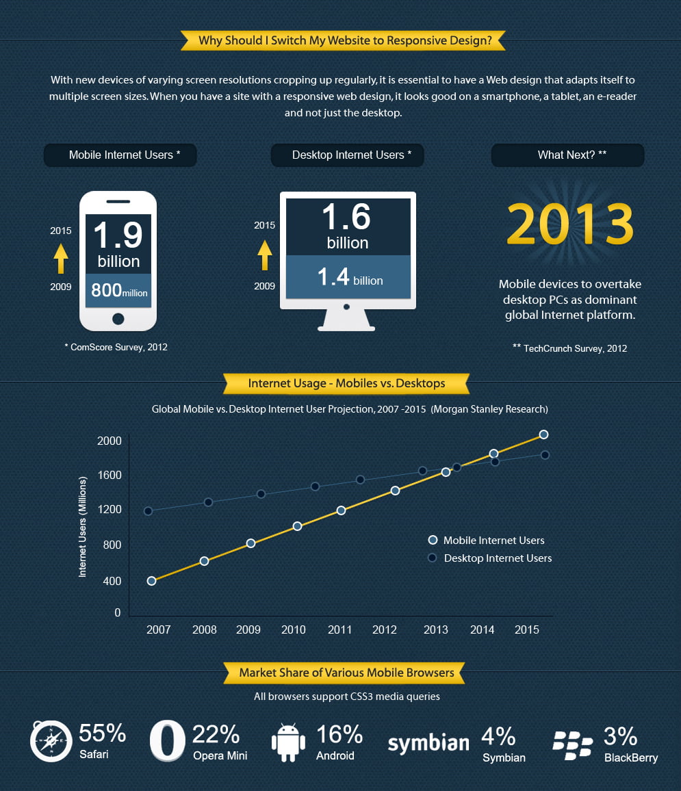
Most websites today are accessed through mobile devices. Yes, this means that most users are browsing the web, most of the time, on their phones and tablets (about 60%). This figure is quite high and varies by demographics, but the point is.. your website should be responsive by now or you are shutting out your market.
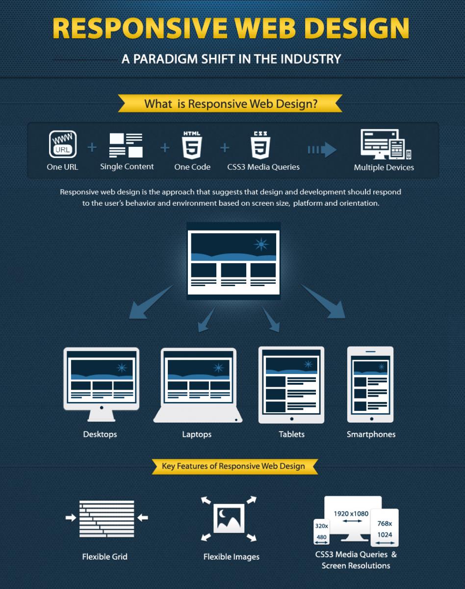
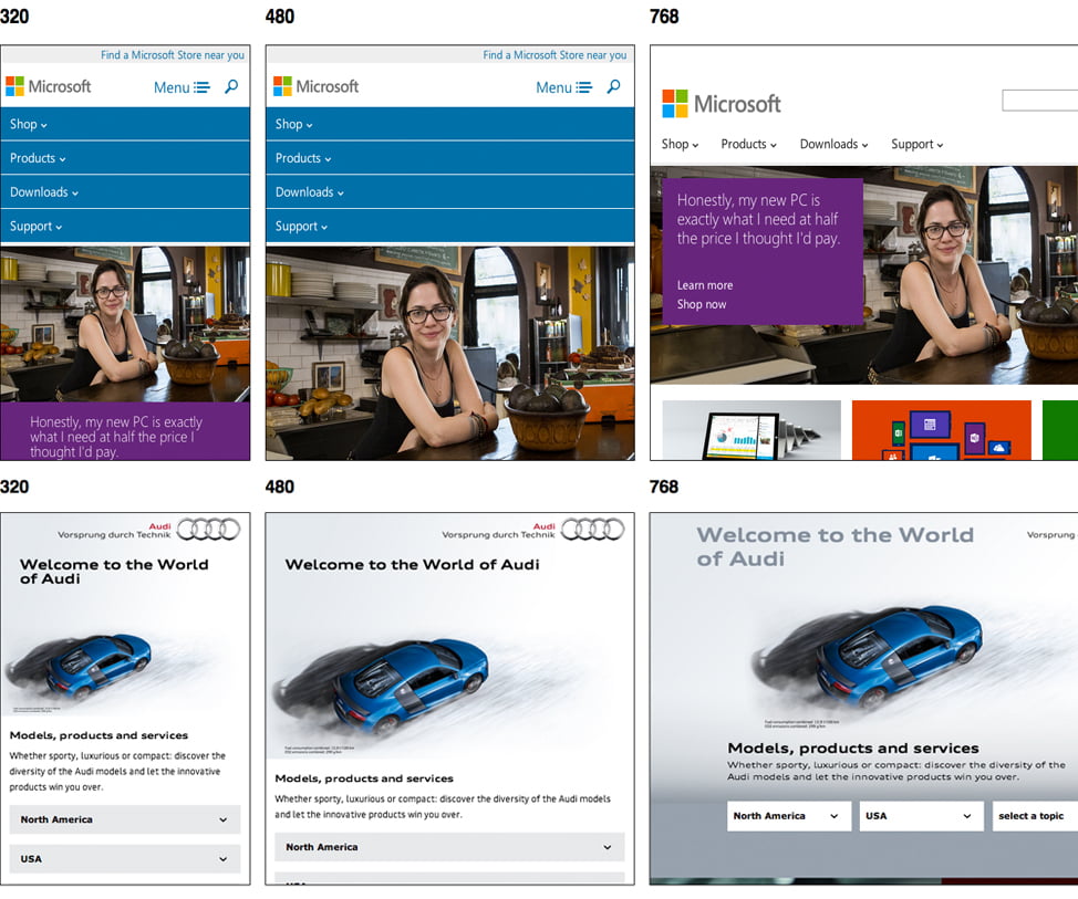
Responsive web design is a form of mobile compatibility that allows a website to adapt its element dimensions to the size of the screen it is viewed on. It produces the best quality user experience across all platforms and devices.
So not only do we constantly worry about multi-browser compatibility – getting your website to look normal in Explorer, Chrome, Firefox, Safari etc., but now it has to look presentable on iPhones, iPads, Blackberries, Androids, Kindles, and all other smartphones/tablets. Will this technological craze ever slow down? No. Lucky for us, the party never ends.
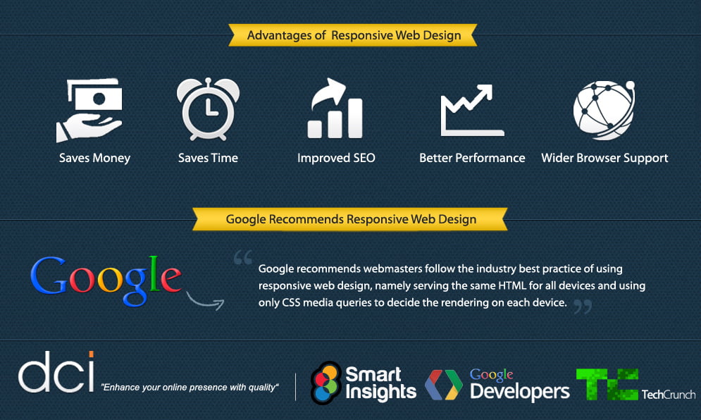
In the olden days, when smartphones were just introduced, business owners had to pray that users could still see their websites properly when viewing from all these different gadgets. If they were in the unfortunate majority, web developers had to design separate versions of the website specifically for the various mobile devices. For many websites, this process was redundant, cumbersome, and impractical. Not to mention, most “mobile websites” looked overly clunky or like simplified menu hierarchies.
Responsive web design emerged to solve this problem by using a single framework of flexible grids that can adjust dimensions to fit any screen area. According to A List Apart Author: Ethan Marcotte, the idea actually derived from a discipline called “responsive architecture,” which suggests that rooms and spaces should physically adapt to the volume and flow of people passing through them. Sounds like something from a sci-fi movie, but not that far fetched anymore. Companies already have motion sensors that prompt climate control, ambient lighting and even “smart glass technology” that can add privacy to any space. The part where the walls bend, flex and expand to accommodate people, well.. let’s just say they’re in the experimentation phase, using a combination of embedded robotics and tensile materials. Imagine that this same exact concept, when applied to digital media, created a revolution in website development.
Responsive web design represents a fundamental shift in how we’ll build websites for the decade to come.
Jeffrey Veen
So who's doing it?