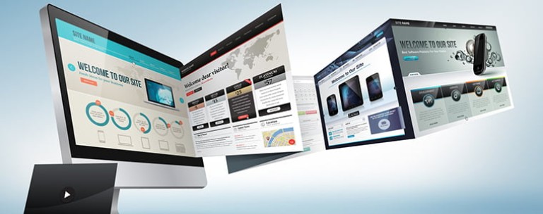
Remember the flashy website introductions that were ever so popular in the 90s? Imagine you are looking to buy a particular product or service so you click on a promising site link.. but wait, sit down. First, this company has to dazzle you with their uber cool multi-media skills. Wooosh! Look at this amazing slideshow! You just wanted to find a local event planner and now you are squinting trying to find the “skip” or “mute” button.
While this example is extreme, it illustrates a common problem today. When building a website, it’s easy to get carried away with the latest design elements, multi-media, social media and all the bells and whistles. But when it comes to aesthetics vs. functionality, the vast majority of your audience will pick functionality. Most of your potential customers are looking for two things:
1) The products and/or services you have to offer
The way you present this section is critical and often the source where web designers get a bit distracted. Make sure the title and/or tagline is clear and states what you offer. Make sure any sub-categories are highlighted on the front page. Lastly, professional images of your products or services are really worth a thousand words.
2) How to buy / sign-up / subscribe / donate / contact you
Every web page that seeks to sell something should have a single dominant call-to-action (CTA) supported by clear sales copy with minimal distractions. The more buttons, alternative options, and widgets you have, the more click-throughs you'll get to other web pages - if that's your goal, great, but if not, keep that sales funnel tight! The phone number should be highlighted on your front page or at the very least, be present on your contact page. Make sure you provide some form of social proof, but don't overdo it. Quality over quantity!
Anything else is clutter. Unless they’re directly related to your business or cause, nobody cares about your widgets, affiliates, random links, background music or scrolling announcements. These items are fluff that may be added to fill an empty space or two but never to an already busy page. Always keep in mind the goal of your potential customer, to buy your product or service or contribute to your cause; how easy have you made it for him/her to reach this goal with minimal distractions?
”People ignore design that ignores people.- Frank Chimero